
Case Study
Pacific Science Center
Igniting curiosity in all
The opportunity
This iconic Seattle Museum need an updated website that better showcased the variety of exhibits and activities they offer, appealed to adults with children and adults without children, was “just as fun” online as it was in person, and better served BIPOC communities.
Approach
We started by really getting to know the brand and showed PacSci how to better reflect their personality in a digital space. Working closely with their team we reorganized content, discussed creating and curating content that would appeal to audiences, did initial usability testing, and performed final validation testing.
My role
Design Lead responsible for visual direction, concepts, design, client presentations, mentoring Design Associate, and assisting UX Lead with design validation testing (which was pretty cool, read on for more about this)…
Web Awards
Davey Awards. Gold, Science Website, 2022
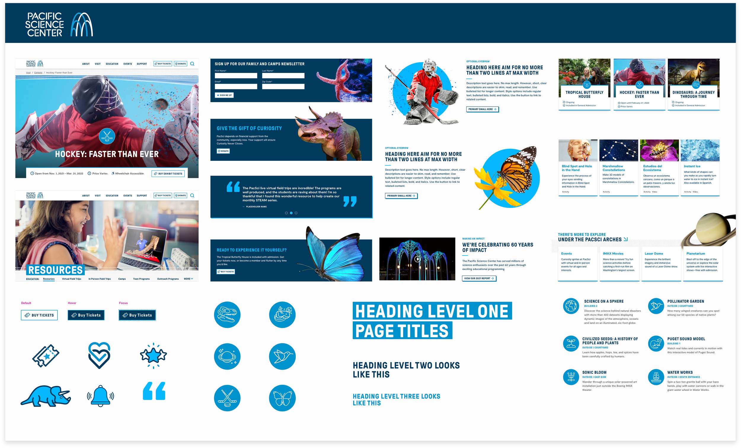
Visual Direction
The client asked me if they needed a rebrand. Not gonna’ lie, when you work with smaller nonprofits the answer is often ‘yes’. But not this time. After reviewing the results of a brand survey I had conducted with key stakeholders and auditing the brand landscape, I felt they simply needed help showcasing their brand in the digital space. I pulled styling and inspiration from assets they already had—working in some ideas of my own—to show how curiosity would come to life on their website.

“Kim just gave one of the most thoughtful and thorough visual direction presentations I’ve seen. Not only are the concepts stunning, but the story of how we got here was so well told.”
Website Design
I had two main goals. First, the design should complement and support the website goals. It needed to be clean, approachable, organized, and content should be easy to find and read. Second, the design should spark joy and create a cohesive experience, down to the tiniest detail. I created icons that matched their logo, text treatments that matched their print material, and immersive imagery with unexpected cutouts, which aligned with their marketing.

“This is beautiful! I love that it is easy and intuitive. It makes me want to visit.”


We took a component-based approach, leveraging the power of WordPress’ Gutenberg Blocks. After defining the basic styles, look & feel, and core design elements, I worked closely with a UX designer and Design Associate to design the full system.

Design Validation Testing
To evaluate the effectiveness of our solutions, and to gather further insight and feedback, we performed design validation testing with a nine page, designed prototype. We interviewed adults with children and adults without children, focusing on BIPOC audiences.

“I love the energy and mix of images. There’s a lot of information, but it feels very approachable.”
“I didn’t know there was so much here. I thought it was a just for kids, but there’s tons of activities for adults too.”
“Is this place real? I will totally go here when they reopen [from pandemic-related closures].”
Impact & Outcomes
A more intuitive, user-friendly, and accessible website that embodied the excitement and fun of their physical location.
Insight and ideas from real people on the types of exhibits and activities they’d be interested in seeing.
A streamlined ticketing system that successfully helped a high volume of visitors when the museum reopened post pandemic closures.
Kudos from the CEO who said the website from ‘horrible’ to ‘inspiring’.
Impact on Me
This project offered the chance to strengthen and expand an amazing brand AND the opportunity to measure the effectiveness of the design. We set out to design a site that felt welcoming and exciting, without sacrificing usability. Validation testing confirmed we were successful.
As designers, we aren’t always able to learn how our work performs. I am grateful to have had that opportunity.